Rebranding a Science-Driven Website

5
Stakeholders interviewed
+17.31%
Increase in website engagement after the first two weeks
+4.9%
Extended scroll rate after the first two weeks
24
New videos and animations
How might we redesign MemoryLab’s brand and website to clearly communicate its scientific and innovation value to potential clients in ed-tech?
Overview
MemoryLab’s previous branding leaned towards a playful aesthetic, which didn’t reflect the scientific rigor behind the product. Additionally, users often struggled to understand what the product did and who it was for.
My goal was to develop a new brand identity for the promotional website, one that clarified the product’s value, resonated with professional sectors, and struck the right balance between innovation and professionalism. I took the lead in restructuring the content, redesigning the layout, and establishing a more aligned visual identity.
Role
Project Management
User Research
Branding
Prototyping
Content strategy
Duration
April to August 2024
Deliverables
Content audit
Competitive Analysis
Site map
Brand Guidelines
Low and High Fidelity Prototypes
Animations
Behavioural Analytics Reports

UX Research
To reframe MemoryLab’s website for a B2B audience, I first needed to understand what differentiates B2B from B2C digital experiences. I analyzed 6 platforms in each category and conducted a SWOT analysis on direct competitors. This helped define a more focused, professional positioning grounded in scientific credibility.
Quick Takeaways
Playful tone misaligned with target audience -> refined visuals and tone to reflect a more professional B2B identity
Most competitors organize content by “Solutions,” “Products,” and “Case Studies” → mirrored this in the new IA
No clear proof of scientific method → introduced a dedicated Research section
Content overload causes cognitive load -> introduced expandable sections and concise messaging to improve scanability and engagement
How did the website look like before?

There was a double menu, creating confusion
The font and color palette were rather playful
Layout mistakes, inconsistent use of colors
Length of text was long and it wasn’t immediately clear what we sell
The robot was more suitable for their learning app rather than the promotional website
Had some trust indicators, but clients testimonials were missing
Primary B2B vs B2C Comparison
12 platforms (6 B2B + 6 B2C)
Long text blocks reduce engagement -> organized copy into scannable chunks
B2B sites focus on Solutions, Products, and Case Studies -> introduced these sections in the IA
Messaging is supported by demos or videos -> introduced animations
Design is minimal and structured, in contrast to B2C’s playful visuals -> removed the robot illustration
Sales or contact people (management) are immediately visible → made the team easy to find and contact
Overly rounded buttons and playful visuals felt unprofessional → swapped for sharper buttons and human-centered imagery

Memorylab position on the brand map on the dimensions scientific credibility and professional aesthetics
How might we reorganise the site?
Given the time constraints and my level of expertise at the time, I based my decisions for reorganising the site primarily on competitor analysis, collaborating closely with another designer throughout the process.
If I were to approach this again, I would start by involving relevant users in a card sorting exercise, followed by tree testing to validate the proposed information architecture. The site map we developed went through several iterations, and below is the final version we aligned on.

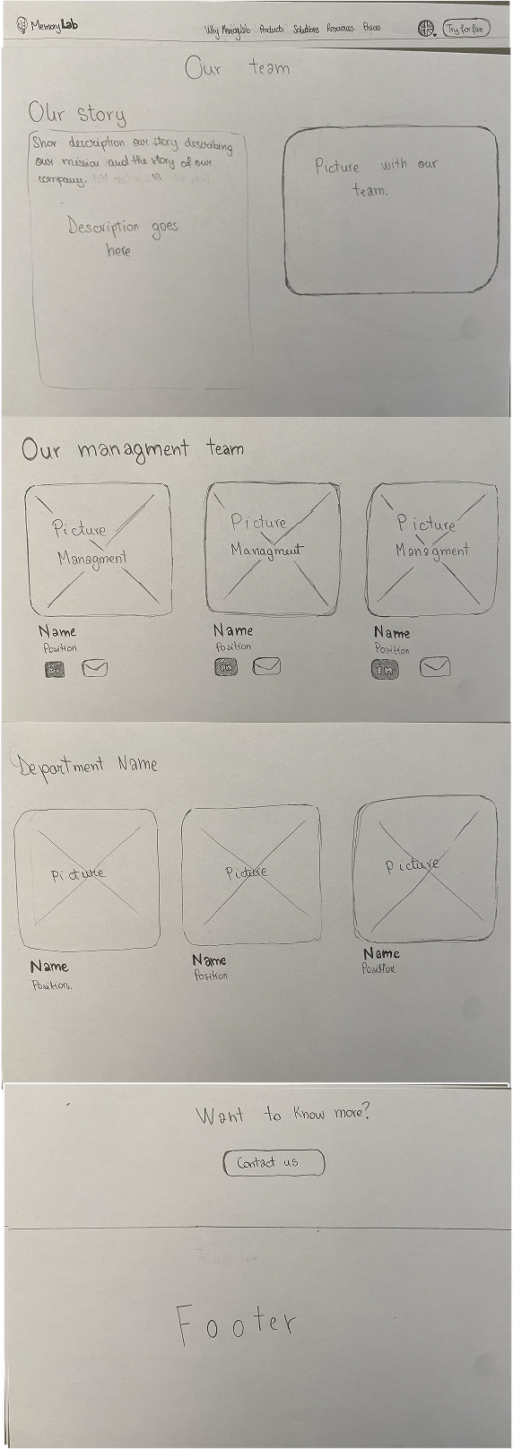

Present a short story of the company
Make management team distinguishable, and contacts as visible as possible
Add solutions, products and case studies to the architecture of the website
Use accordion menus or expandable sections to reduce cognitive overload
At all times add a section in which people can contact the company for a demo
Add testimonials from clients to increase trust
Brand Identity and High Fidelity Prototypes
My main task was to create the new wireframes for the website, but my role naturally expanded beyond that. I also took on the responsibility of project-managing the content delivery, making sure everything, from visuals to copy, was completed within the agreed timelines.
Because we agreed that animations would be a key element in showcasing the tool’s main functionalities and deliverables, I took the lead on creating all the illustrations and animations. This meant stepping into a new role within the startup, one that pushed me outside my comfort zone. Over the course of three months, I designed and animated 24 custom animations, with multiple iteration and feedback from the team. Meanwhile, the marketing team handled the copywriting, which I integrated into the high-fidelity prototypes.
An innovative, trustworthy and scientific visual identity
This brand identity was designed to convey trustworthiness, innovation, and professionalism. Visually, it blends elements of Swiss design, known for its clarity and structure, with a more corporate, modern look. The result is a clean and precise aesthetic that still feels modern and approachable.
The color palette was carefully curated, where blue was selected to balance the magenta primary accent, creating a sense of calm and credibility while maintaining visual interest. For typography, I chose Lato and Open Sans, both highly readable and professional, ensuring accessibility and aligning with our values of clarity and inclusivity.

Improved layout and engagement
For the wireframes, I collaborated closely with another designer and built out the new screens in Figma, creating reusable components. As shown in the screens below, we aimed to increase user engagement through animations while also reducing cognitive load by introducing accordion structures that keep the layout clean.

Emphasised awards and clients testimonials
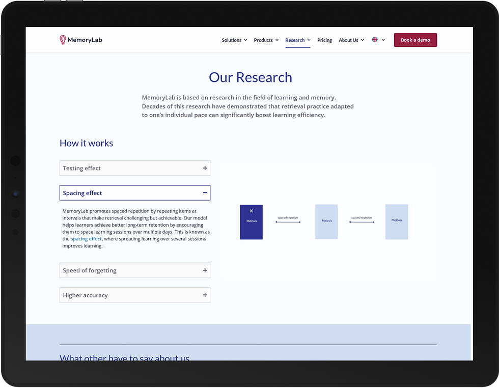
Created animations to help understand scientific content

Added case studies
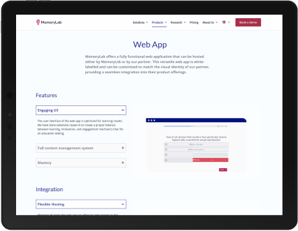
Included both animations and accordion layout to better understand the services offered


Project Manager for Digital Learning Media
“The descriptions are short and snappy. Even though I’m not from a traditional IT background, I understand everything”
Product Manager
“I like the clean look and the ease of reading. The design is not overly colorful, which is good.”
Testing
After creating the first screens in Figma, I immediately tested them before moving forward with development. Our main goal was to validate whether users could more easily find products and whether our new brand identity clearly reflected the product we were offering.
The website was built in WordPress, and once development was completed, I conducted a before-and-after analysis using Google Analytics to assess impact.
Quick Takeaways
Playful tone misaligned with target audience -> refined visuals and tone to reflect a more professional B2B identity
Most competitors organize content by “Solutions,” “Products,” and “Case Studies” → mirrored this in the new IA
No clear proof of scientific method → introduced a dedicated Research section
Content overload causes cognitive load -> introduced expandable sections and concise messaging to improve scanability and engagement
Stakeholders interviews
To complement the data, I also interviewed 5 of our clients in managerial roles, focusing on four key criteria:
1. Does the new brand identity reflect the company?
2. Are the products easy to find and understand?
3. Is the vocabulary used clear?
4. Is there anything missing?
4 out of 5 said the new brand identity represents the company well
4 out of 5 said they could clearly understand what we offer and where to find it
4 out 5 understood the terminology used
1 user pointed out that we could focus more on the emotional component in the copywriting
Behavioural data helped us find mistakes
After launching the new website, I ran a comparison in Google Analytics, looking at user behavior on the MemoryLab page two weeks before and after the redesign. Here’s what stood out:
User acquisition remained stable, no significant change in the number of new users
Engagement increased by 17.31%, possibly due to the addition of animations
Users scrolled more, with a 4.9% increase in scroll rate
But most importantly, this analysis helped us identify a major usability issue. Through this analysis we observed that all Dutch pages were redirecting to a Page Not Found due to a translation bug. Thanks to this, we were able to quickly fix the issue and improve accessibility for Dutch-speaking users.


Project Learnings
Rebranding this website was a fun challenging experience that taught me a lot. First and foremost, research was crucial to the success of this project. Understanding our target users and recognizing the key differences between B2B and B2C was essential.
In this project, I had the opportunity to learn animations and motion design. Additionally, cross-functional collaboration with various experts within the company helped me have a better understanding of the product.