From read to send in two steps:how I cut report-building time by 75%

5
Users interviewed
-75%
Less time spent on crafting report based on latest news
≥ 95 %
Users that understand how to use the new feature without any help
4.2 / 5
Preference score for new design solution over pas one
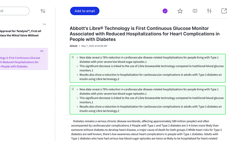
Help consultants add article paragraphs to emails, newsletters, or reports without disrupting their reading flow
Overview
A side project grown into a subscription platform that helps consultants collect industry news and deliver tailored briefs to their teams. I first came on board for a quick freelance assignment, but the collaboration soon evolved into a long-term product-design partnership. Since then, I’ve redesigned more than a dozen user flows. This case study spotlights just one, the “Add to email/report/newsletter” flow that lets analysts add article paragraphs directly into their final reports.
Role
Project Management
User Research
Prototyping
User Testing
Duration
2 weeks
Tools


Interviews
Heuristic Audit
Success Metrics Testing
User Flows
Prototypes
Design System
Interviews
Heuristic Audit
Success Metrics Testing
User Flows
Prototypes
Design System
Interviews
Heuristic Audit
Success Metrics Testing
User Flows
Prototypes
Design System
Interviews
Heuristic Audit
Success Metrics Testing
User Flows
Prototypes
Design System
Interviews
Heuristic Audit
Success Metrics Testing
User Flows
Prototypes
Design System

Problem Statement
• Adding article paragraphs to emails, newsletters or reports is currently possible in a pop-up modal that takes users out of their reading flow and feels disconnected from the page context.
• First-time users find the “Add” button disabled with no hint of what to do next.
• When the modal finally opens, it demands a team and keyword selection to assign the article to, but offers no guidance where to set this up, leaving newcomers unsure how to begin.
Goals
Allow users to add paragraphs without leaving the article view
Display call-to-action and hints so first-time users know the next step
Edge case are covered: no article selected, missing teams or keywords, and successful additions all handled with clear, guided states
Users can quickly take a paragraph out of the report builder with a single click
UX Research
As part of a full redesign project, this user flow problem first surfaced through interviews and surveys with consultants who had been using the tool for over a year and shared their overall observations. In parallel, a heuristic analysis of the previous design helped identify additional usability issues that confirmed the need for a deeper redesign of this flow.
Quick Takeaways
Modal disrupted reading flow → replaced with inline slide-in panel
Disabled add button did not communicate next steps → add a hoverable tooltip
Users cannot delete paragraphs added easily → allow for inline paragraph deletion
New users might be unclear on next steps → use inline guidance and call-to-actions guidance
Previous research and app functionality
Due to the confidentiality of this case study, I have included one user flow without giving too many specifications to the tool whole functionality.
This user flow is part of a full redesign project after one year of the product's initial launch
The tool helps users build daily news-brief reports directly within the dashboard
Users organize articles into folders (keyword groups) and assign them to the relevant team
User set up during onboarding the type of report they want to create: an email, a PDF report, or a newsletter
Surveys and interviews
5 users surveyed
3 users interviewed
Users read many article everyday → keep flow for adding content in less than 2 steps
Flow felt easy → kept simplicity
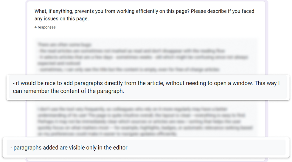
Opening a modal breaks context → enabled inline paragraph selection
Can't see what's already added → show added excerpts instantly with undo
“We need to be able to easily add paragraphs and group them into the corresponding pillars.”
- Junior Consultant
“Everyday we scan multiple articles. We have to be fast in doing this and deliver the latest news to our teams.”
- Senior Consultant


Recognition rather than recall
New users didn’t know what to do next when they had no team or keyword group set up, and where to do that
Match between system and the real world
Terms like “pillars” may not be familiar to all users
Aesthetic and minimalist design
Less modern aesthetic and somehow cluttered
User control and freedom
No easy way to undo or remove added content from the article, but only from the editor
Error prevention
“Add” button when disabled hs no explanation, leading to confusion
Heuristic analysis
NN/g heuristic analysis
Hypotheses
H1
95% + completion rate
Add to email using inline panel
Users know how to add to email using the new inline panel
H2
95% + completion rate
Assign article to keywords & team category
Users know how to assign an article without help
H3
95% + completion rate
Delete assigned paragraphs
Users successfully remove paragraphs when needed
H4
≥ 4 on Likert scale
Prefered inline panel over modal view
Most users prefer the inline panel for adding articles
Ideation
User flow

Wireframes
Inline panel
Modal disrupted reading flow
-
Added an inline panel
-
Users can still scan the selected paragraphs for easier categorisation

Tool tips and shortcuts
New users missed paths forward
-
Added a tooltip on hover when no paragraph is yet selected
-
Included contextual shortcuts to create new keywords groups or teams from the slide-in panel
-
Inline guidance & error states are present for each entry missing


Undo options
Deleting selected paragraphs was possible only in editor
-
Paragraphs selected are now visible
-
Users can now undo paragraph selection directly from the article


Design components


Testing
I created an interactive prototype for this flow, along with a series of short prompts and a single Likert-scale question to test the design hypothesis.
Quick Takeaways
Users can use the inline panel intuitively -> prepare design for developers hands-off
New terminology felt ambiguous -> run card sorting to validate terms
Deleting paragraphs was intuitive
Users prefer the inline panel over modal -> keep inline panel
Prompts questions and results
For this quick testing I have asked 5 users the following prompts, using the think-aloud method:
H1: Can you show me how you would add new paragraphs from this article to your email?
H2: How would you assign that article to its corresponding categories?
H3: Finally, please remove the first paragraphs you just added.
H4: Can you please rate this statement from 1 to 5, where 1 = strongly disagree and 5 = strongly agree, “I prefer the inline panel method over the previous pop-up modal.”?
H1
5/5 users
Add to email using inline panel
Users know how to add to email using the new inline panel
H2
5/5
Assign article to keywords & team category
Users know how to assign an article without help
H3
4/5
Delete assigned paragraphs
Users successfully remove paragraphs when needed
H4
4.2/5
Prefered inline panel over modal view
Most users prefer the inline panel for adding articles
Observations
Deletion of paragraphs was confusing for one user
-
Observation: One user clicked inside the paragraph text instead of the trash icon to delete it.
-
Insight: Users expect to interact with the paragraphs they want to remove, the same way they select/deselect a paragraph.
Ambiguous terminology
-
Observation: “Keyword group” and “team group” were unclear, some thought “team” meant project members, and “keyword group” was not recognised as “pillar.”
-
Insight: Labels need validation, run a quick card-sorting or tree-testing exercise to identify the most intuitive terms.

Junior Consultant
“The tool very effectively pinpoints the articles that are of importance to us, and it is really straightforward to use.”
Senior Consultant
“You can see an improvement in how quickly we create our daily report. It now takes 30 minutes instead of two hours per day.”


Project
Learnings
Throughout this project, I rediscovered the power of continuous learning through rapid experimentation. By running small, targeted usability tests on this user flow, I was able to validate design decisions quickly.
This redesign also helped bring structure to my design process, following steps and planning in order to uncover valuable insights for improving the product. The most valuable lesson was seeing how much I’ve grown in one year as a designer, identifying usability problems that I wouldn’t have noticed last year.