Designing a math app piloted in 11 Dutch schools with 600+ children

4,35 / 5 stars
UXKQ scale
.png)
600+
Children who participated in the pilot testing
80.9
System Usability Score obtained from usability testing with 8 teachers
27%
Faster response time after children reached level 3 in the app
27
Children moderately tested to validate design decisions
4.35 / 5
UXKQ Score from 79 child participants assessing the app’s desirability
1
Publication on experimental and usability findings
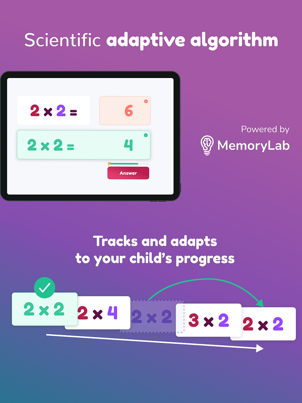
Boost multiplication accuracy and cut response time by 27% with an adaptive, distraction-free learning tool
Overview
Young learners often practice multiplication using paper exercises or online games that can be overly distracting. MemoryLab already offered an educational app for secondary and high school students, but lacked a tool tailored for a younger audience.
I was given the design challenge of creating an educational app for children aged 7–11, where gamification would be balanced and their adaptive algorithm intuitively integrated. The app would be integrated within a learning portal for primary education as a Saas. I found myself inside a fast-moving startup, designing a tool that soon reached classrooms across the Netherlands and made learning the times tables 27% faster.
Role
Project Management
User Research
Branding
Prototyping
Duration
5 months
Tools


User Research Reports
MVP Prioritisation
Brand Guidelines
Prototypes
User Research Reports
MVP Prioritisation
Brand Guidelines
Prototypes
User Research Reports
MVP Prioritisation
Brand Guidelines
Prototypes
User Research Reports
MVP Prioritisation
Brand Guidelines
Prototypes
User Research Reports
MVP Prioritisation
Brand Guidelines
Prototypes
User Research Reports
MVP Prioritisation
Brand Guidelines
Prototypes
User Research Reports
MVP Prioritisation
Brand Guidelines
Prototypes
User Research Reports
MVP Prioritisation
Brand Guidelines
Prototypes
Prompt testing

Problem Statement
• Apps often use generic designs that don’t adapt to individual learning needs or diverse abilities (e.g., dyscalculia, ADHD).
• Many platforms include gamification elements that are either distracting or demotivating, undermining intrinsic motivation.
• Integrate the company’s adaptive algorithm into a product for ages 7–11 that outperforms other algorithms and keeps learning fun and engaging.
Goals
Design an inclusive interface optimized for children aged 7–11, including those with learning differences
Integrate evidence-based game elements that enhance motivation and engagement
Use UI elements that make mastery understandable to children
Ensure that gamification enhances, rather than distracts from, the core goal
UX Research
At the beginning of the project, I wasn’t sure what truly engaged children in educational games. To better understand this, I chose a three-point research approach: conducting in-person interviews with students and teachers, and diving deep into gamification literature and competitors. My goal was to identify gamifications and design principles that would encourage and motivate children to reach their learning objectives.
Quick Takeaways
Confusing instructions break focus → present each task upfront in clear, child-friendly language
Progressive levels & narrative boost intrinsic motivation → add a mastery path with story
Leaderboards creates unnecessary competition → aim for encouraging feedback
Teachers need customisation options → include custom times tables modality
Primary Research
2 teachers
2 pupils
Confusing instructions break focus -> present task at the beggining of each exercise using child-friendly language
Both children and teachers love progressive difficulty -> create a mastery path with levels
Fantastical characters raise engagement -> introduce fantastical backgrounds and characters
Teachers need customisation freedom -> introduce a modality to mix more times tables
Gamification Literature Review
+12 peer-reviewed papers
Leaderboards can foster unhealthy competition → avoided
Narrative sustains attention → integrated light story
Rewards should be used aligned with learning goals to support intrinsic motivation -> added glowing numbers as rewards
Encouraging language is critical, especially when learners make mistakes -> add encouraging language in feedback
Benchmarking
4 competitors apps
Ads create unnecessary distraction → created ad-free space
Direct mastery path → visible level progression
Customisation is missing from many competitors → add a custom mode
Accessibility for SEN children is not directly visible → prioritise SEN design principles

Ideation
We didn’t jump straight into high-fidelity prototypes. We understood that this was a concept created by adults for children, and their understanding differs from ours. That’s why we began with preliminary testing on our proposed design solutions.
Narrative in learning
Research clearly showed that having a narrative helps keep children engaged and goal-oriented in educational apps. We proposed three storytelling elements:
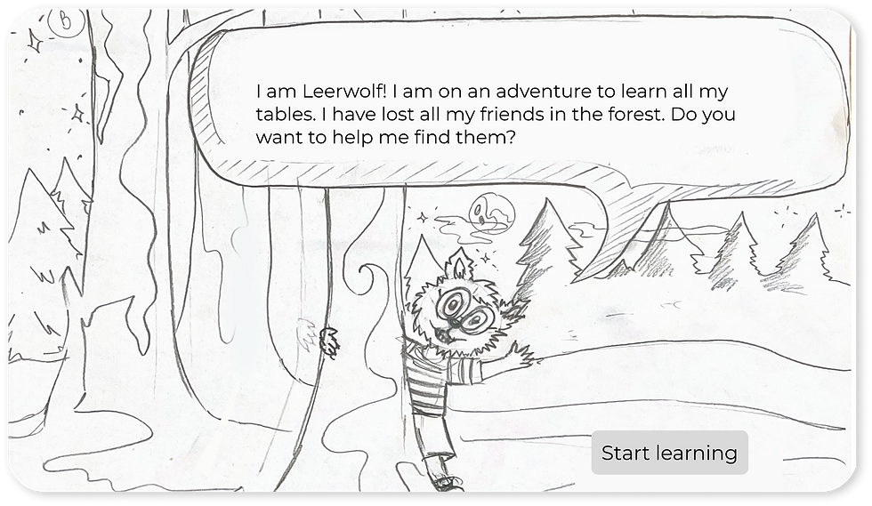
A magical forest where a curious little werewolf is searching for his lost friends
Each time a times table is mastered, one friend is discovered
Found friends appear on the homepage, giving a sense of progress
Learning, one step at a time
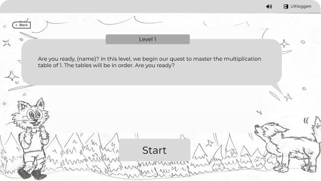
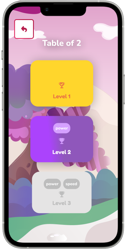
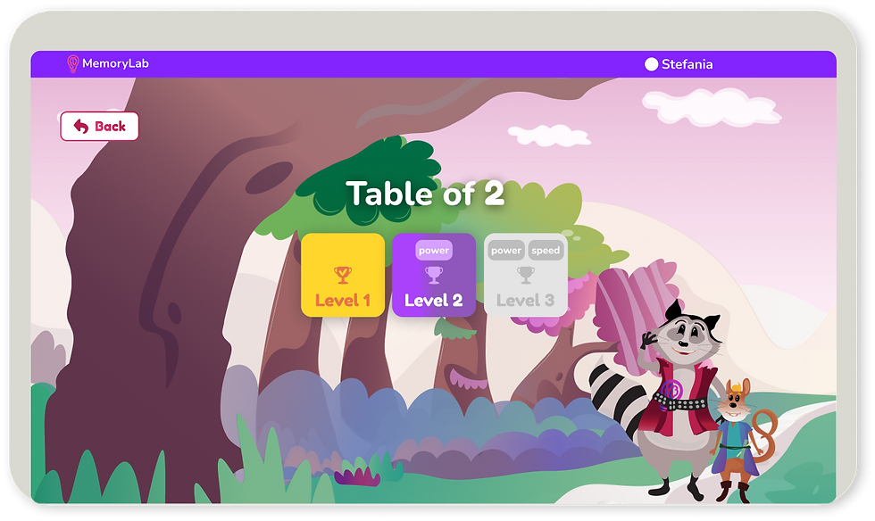
With my background in cognitive science, I had a solid grasp of the learning model we were applying. Together with a senior researcher and another designer, we created a stepwise approach to learning. Literature and student feedback both emphasized the importance of making exercises progressively more difficulty. We proposed three levels as follows:
Level 1: No algorithm, for initial familiarization with the times tables.
Level 2: Focused on accuracy, the algorithm introduced only the multiplication facts that were less accurate
Level 3: Targeted automatisation with an 8-second time bar and the MemoryLab adaptive algorithm, adjusting for both speed and accuracy
We also included a “Mix Tables” feature that used the same algorithm as Level 3, for learners wanting to combine different tables.

User flow

Early testing, big findings
We run a fast round of moderated usability testing with 8 learners aged 7-8 years old and focused on the following goals:
Overall usability: Where did children get stuck or confused?
Vocabulary and reading comprehension
Understanding of level progression
6 out of 8 children understood all the words in the bubble texts


During this pre-testing phase, we discovered that some words needed to be simplified to better match the vocabulary level of young learners. We also found that the moon icon wasn’t clearly associated with level progression.
To improve clarity, we decided to use more familiar visual elements, such as trophies. On a positive note, the game’s navigation proved to be intuitive, as most children moved through it with ease.
8 out of 8 children know how to start an indicated time table
4 out of 8 children didn’t understand that the moon gets full with each level passed
7 out of 8 children know how to select a specific time with the slider and times tables to practice with
Brand Identity and High-Fidelity Prototypes
During a discussion with stakeholders after initial testing, we discovered that our original character resembled one from a well-known Dutch story involving a werewolf. To avoid confusion or unintended associations, we quickly adapted and brainstormed a new concept. This led to the creation of not one, but two fresh characters, Raccoon, a curious learner eager to master times tables, and Mr. Muis, his wise and supportive friend. In the new storyline, each time children master all three levels of a times table, a glowing number appears in the forest, adding an exciting magical element.
A fun and vibrant visual identity
I developed a captivating brand identity that merges education with a sense of magic. The game features two vivid, friendly characters guiding children through their learning journey. The visual style is whimsical and approachable, using gradients in purples, magentas, and bright colors to create an enchanting fantasy world. Typography is playful yet readable, and icons are tailored to resonate with the target age group.

Outcome
A story-driven design with loveable characters
A progressive automation system with three levels of difficulty and two algorithms
Minimal gamification using familiar elements like trophies
Visual feedback (e.g., glowing numbers for all level completion) to boost intrinsic motivation
Encouraging messages after mistakes
Fonts and buttons tailored for small hands

Select modality of learning

Choose a time table

Make a mistake

Mix multiple tables


Inclusive and accessible design
No ads, no pop-ups, minimal extraneous UI for children with attention deficit
Numbers are easy to scan for children with dyscalculia
Big buttons, ample spacing, and simple back/forward flow
Feedback always encourages retrying


Math Teacher
“The nice difference is that there is no competitive element in Times Tables.”
Math Teacher
“The students find Times Tables very enjoyable and are enthusiastic.”
Math Teacher
"Times Tables proves to be very effective for memorization".
Usability Testing
Following the launch of the app, I conducted a comprehensive research plan to validate its usability and desirability in real classroom settings. Children started using the app in 11 schools with more then 600 children piloting the new product. After the first week of use I started collecting data for the research part. The research plan included:
A moderated usability test with 27 children
A SUS (System Usability Scale) completed by 8 of the teachers involved in the pilot
A desirability study with 79 children
Quick Takeaways
Feedback display time was too quick → increased display time to 3s
Levels length felt irregular → improved length level 1 & 2
Timebar felt too fast -> began research to determine ideal time-bar pacing
Users needed more engaging elements → added new subjects and collectible artifact badges
The app in classroom settings
To better understand how children interacted with the app, I created prompt questions focused on four key criteria: visual design, effective system use and understanding, gamification and engagement, and learning outcomes. I recorded both qualitative observations and quantitative metrics, such as completion and error rates, and grouped responses into themes.

The feedback after answering was too quick, and 10 out of 27 children didn't have enough time to read it.
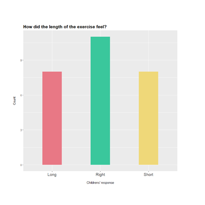
Impressions on exercise length were divided: 8 children felt that Level 2 was too long, while another 8 thought Level 1 was too short.
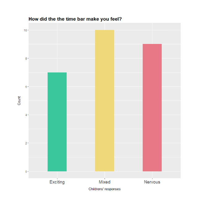
Overall, the 8-second time bar made the children feel a bit overwhelmed by the pace.

Logging out was challenging for 22% of the children because they would log out from the portal
Usability testing from the teacher’s perspective
Because the children were too young to complete a SUS scale themselves, we sent an adapted questionnaire to the 11 teachers involved in the pilot. They answered based on both their own experience and by observing the children using the tool in class.
We were pleased to see a high usability score, with an average of 80.9 across 8 teacher responses, indicating that the tool was easy to use and well-received in the classroom.

The average score on the SUS scale was 80.9 across 8 teachers
Children gave us a high rating
To evaluate how much the children enjoyed the app, we sent UXKQ questionnaires (User eXperience Kids Questionnaire – Wobbekind et al., 2021) to the 11 schools. This scale is specifically designed for young users and captures hedonistic aspects like fun and aesthetics, as well as the perceived quality of learning.
The children colored stars to rate how they felt. We received 79 responses, with an overall score of 4.35 out of 5.
While most feedback was positive, the lowest score was on the “Boring/Fun” dimension. Some children suggested adding more subjects or more characters, or perhaps animations.
Scores were also low on the dimension “Easy/Difficult”, where we suspected the timer contributed to making the game feel a bit difficult at times.

The average score among all dimensions was 4.35 out of 5.
A publication on the research findings
Together with my colleague, a senior researcher, we prepared a paper and presented our findings as a poster at the Cognitive Science (CogSci) Conference in Rotterdam, 2024. This was such a rewarding moment for me, to see how all the hard work came together in the end.
From the performance data we collected on the two learning algorithms, we found that children became 27% faster on average after completing Level 3.
We introduced more subjects and themes for engagement and fun
Level 1 is repeated twice to make it last longer
Algorithm in Level 2 has been reviewed, making the exercise length feel less long
Research team started investigating the ideal length for the time bar to make children feel less nervous
Mr.Muis’s feedback lasts now longer on the screen, around 3s
Removed double log-out; children exit through the study portal so it was not needed


Project Learnings
This project concluded with a publication validating our algorithm, followed by the successful launch of our application in the App Store, for which I designed all promotional materials.
Reflecting on this experience, I gained valuable insights and enlarged my expertise in UX. What fascinated me most was the continuous integration of Cognitive Science with UX design. I particularly enjoyed the cross-functional collaboration throughout the process. The most important lesson I learned was the value of engaging directly with users and observing their interactions with the product in real-world settings, which provided critical insights for improving the app.